
Working with large datasets can be overwhelming, but with the right approach, you can extract meaningful insights and create compelling visualizations. In this blog post, we’ll walk through the process of finding a dataset, cleaning and organizing it, summarizing it using pivot tables, and finally visualizing key insights in Datawrapper. We’ll use a dataset on global traffic accidents from 2023 and 2024, containing 10,000 rows of data, as an example.
Step 1: Finding a Dataset
The first step is sourcing reliable data. Three excellent sources for open datasets include:
- Kaggle – Visit kaggle.com/datasets and search for relevant keywords such as “global traffic accidents.” Choose a dataset that fits your needs and download it.
- World Bank – The World Bank Data portal offers datasets on economic, environmental, and societal trends.
- Google Dataset Search – Go to datasetsearch.research.google.com to explore datasets from multiple sources.
Once you find a suitable dataset, download it in CSV format so we can begin processing it. I searched on Kaggle.com and found the following dataset: https://www.kaggle.com/datasets/adilshamim8/global-traffic-accidents-dataset
You can also download the data file from this website:

To download the dataset, click on “Download” (note: you must register on Kaggle to access the file). The dataset will be downloaded as a .zip file, which needs to be extracted. After extraction, you will find a Microsoft Excel file named “global_traffic_accidents”. Alternatively, you can download the data file here.
You can open this file using Microsoft Excel or Google Sheets for further analysis.
Step 2: Cleaning and Organizing the Data
After opening the dataset, it’s important to check its structure. Our dataset includes:
- Date
- Time
- Location
- Weather Condition
- Road Condition
- Vehicles Involved
- Casualties
- Cause of accident (e.g., speeding, weather, drunk driving)

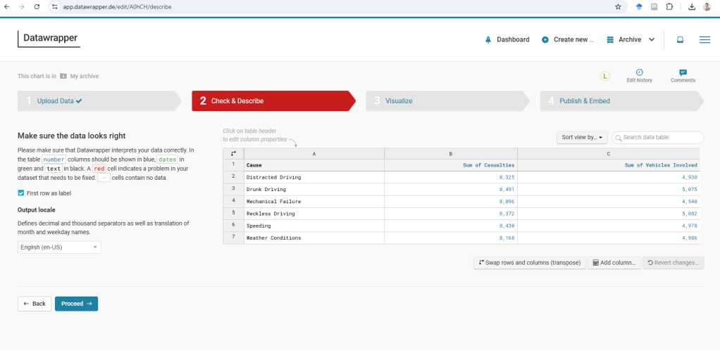
You will notice that this global traffic accident data file has 10,000 rows. Let’s tidy up. Dates might be inconsistent—let’s format them properly. I’ll also check for duplicates or blank cells. Clean data means accurate visuals later!
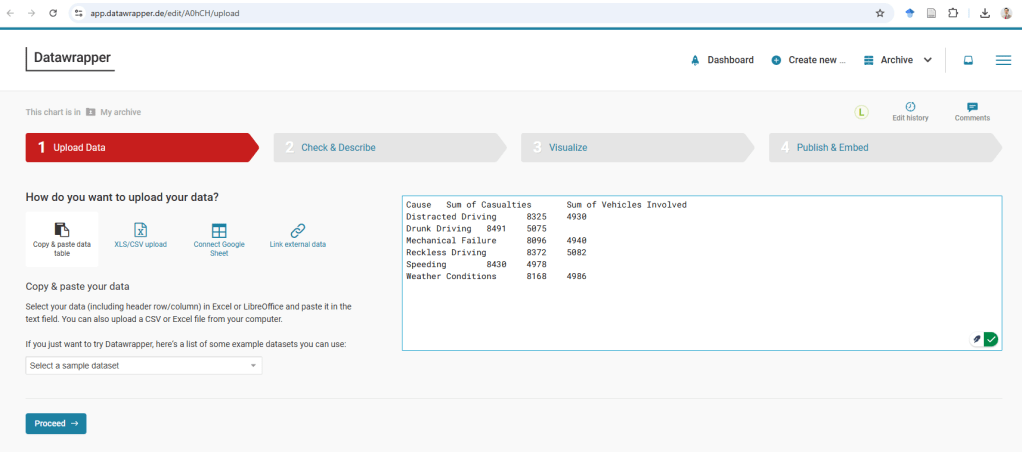
Now, with 10,000 rows, uploading this directly to Datawrapper could crash it or create cluttered charts. Instead, we’ll use pivot tables to shrink the data and uncover key trends.
Summarizing data in a Pivot Table:
A Pivot Table is a powerful data analysis tool commonly used in spreadsheet applications like Microsoft Excel and Google Sheets to summarize, analyze, and reorganize large datasets. It allows users to dynamically group, filter, and aggregate data without altering the original dataset. With a few clicks, you can calculate totals, averages, counts, and percentages across different categories, making it an essential tool for business intelligence and reporting. Pivot Tables are particularly useful for spotting trends, comparing values, and generating insights from complex data. They also support drag-and-drop functionality, enabling users to quickly arrange and manipulate data by rows, columns, and values to gain meaningful insights.
In Microsoft Excel, creating a Pivot Table is a straightforward process that provides powerful data analysis capabilities. To begin, open your dataset and select any cell within the data range. Then, navigate to the “Insert” tab on the ribbon. Here, you have two options:
Recommended PivotTables – This option allows Excel to automatically analyze your dataset and suggest Pivot Table layouts based on common summarization patterns. It is a great choice for beginners or those looking for a quick way to visualize their data without manually configuring fields.
PivotTable (Manual Creation) – Selecting this option lets you create a Pivot Table from scratch. A dialog box will appear, prompting you to choose the data range and the destination for the Pivot Table (either in a new worksheet or an existing one). Once the Pivot Table is inserted, the PivotTable Fields pane will appear on the right side, allowing you to drag and drop fields into Rows, Columns, Values, and Filters to customize the report according to your needs.
Let’s summarize using Pivot Tables! For example:
- Casualties by Cause—are speeding or bad weather deadlier?
- Casualties and Vehicles Involved by Location—which cities/countries have the most incidents?
- Casualties by Road Condition—do icy roads lead to more deaths?
We have now created a few pivot tables for each of the questions.
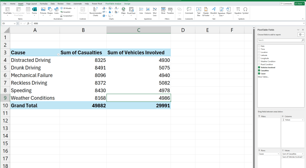
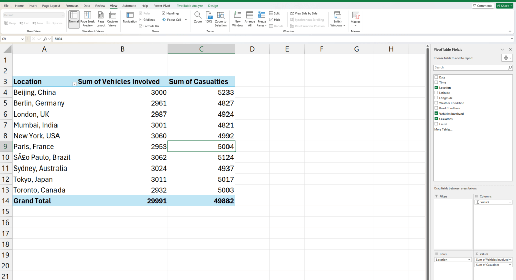
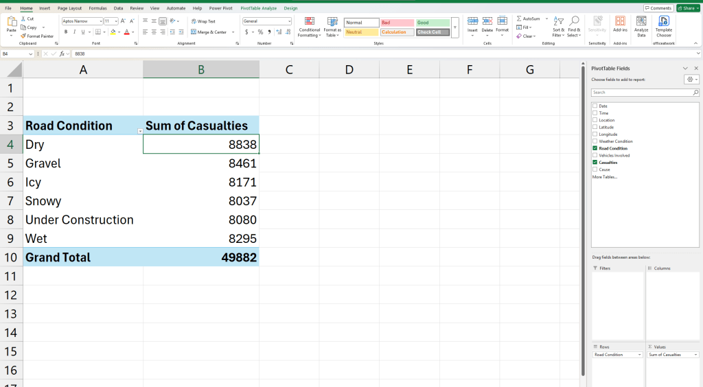
See how grouping data instantly clarifies patterns? Now, instead of 10,000 rows, we have a focused summary. Now that we have summarized data and clear questions, let’s move to visualization.
Step 3: Visualizing the Data in Datawrapper
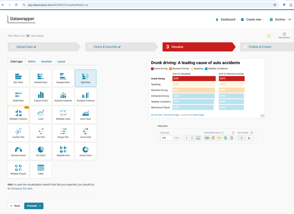
We’ll create three visualizations to answer our key questions.
Casualties by Cause


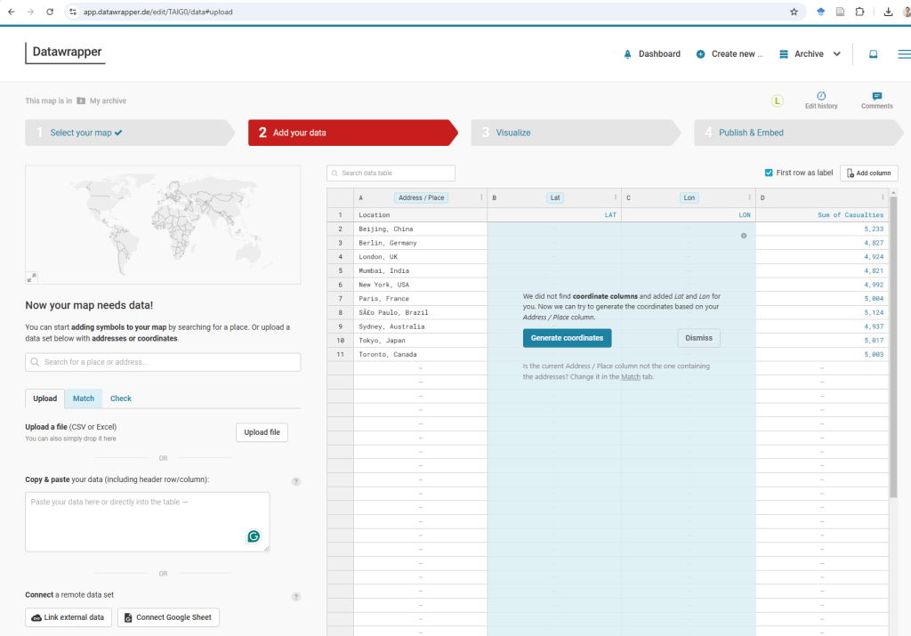
Casualties and Vehicles Involved by Location
Second Visualization: Casualties and Vehicles Involved by Location—which cities/countries have the most incidents?
The second visualization focuses on Casualties and Vehicles Involved by Location, highlighting the cities and countries with the highest number of incidents. This visualization will help identify hotspots where road accidents result in significant casualties and involve multiple vehicles. The visualization can also provide insights into the severity of incidents in different locations, aiding policymakers and researchers in developing targeted road safety measures.
To answer this question we will create a Symbol map in DataWrapper.

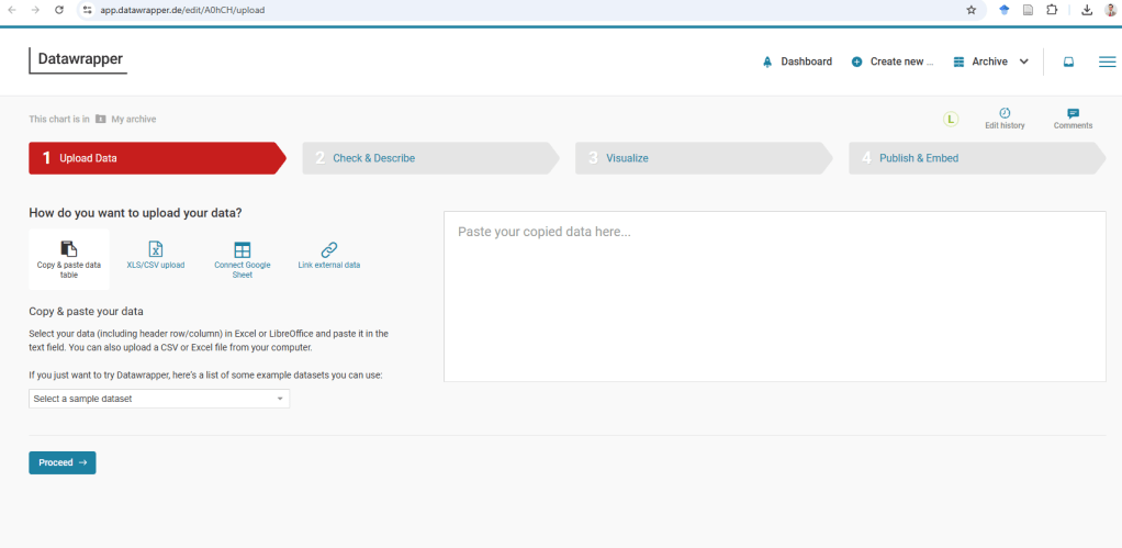
First, we paste the data from the Pivot Table into Datawrapper. The platform will then prompt us to confirm whether it should generate coordinates for the listed cities.
Once the latitude and longitude information is added—either automatically or manually—we can proceed to the next step in the visualization process.


In this step, we have the option to refine, annotate, and adjust the layout of the map. This allows us to enhance the clarity and presentation of the visualization by fine-tuning details such as color schemes, labels, and data points. The annotation feature helps highlight key insights, such as the most affected locations or notable trends. Additionally, modifying the layout ensures that the map is visually engaging and easy to interpret, making it a more effective tool for analysis and communication.
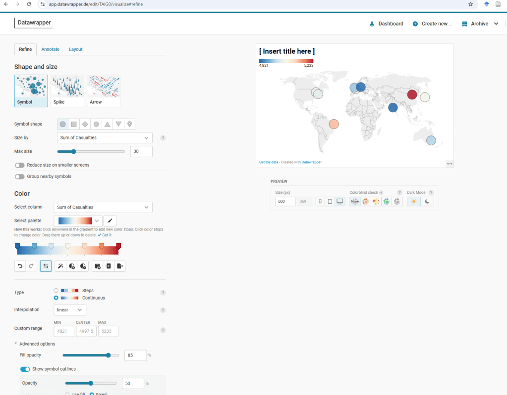
I encourage you to explore the various functionalities available to enhance the map’s visual appeal and readability. Experimenting with features like color schemes, labels, tooltips, and layout adjustments can help create a more engaging and informative visualization.
Here is the final version of the map, complete with an attention-grabbing title and a well-crafted subtitle that provides context. Additionally, I have utilized the tooltip functionality in Datawrapper to highlight Beijing, China, making key insights more accessible and interactive for viewers.

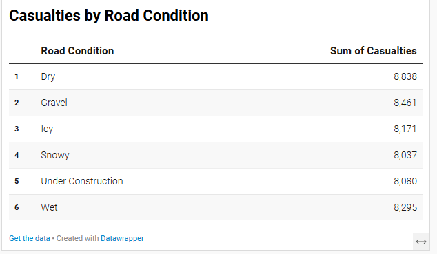
Casualties by Road Condition
For the third visualization, we aim to analyze Casualties by Road Condition, specifically exploring whether icy roads lead to more fatalities. To effectively present this data, we will use the “Chart” function in Datawrapper.

To answer this question, we have multiple visualization options, including a bar chart, a range plot, or a well-structured table. Testing different formats is essential to determine the most effective way to convey insights. I chose the range plot because it provides a clear comparison of accident casualties across six different road conditions.


From this visualization, we can see that dry roads account for the highest number of accidents, followed by gravel. This suggests that factors beyond road conditions, such as driver behavior, speed, or traffic volume, might play a significant role in accident causation—elements not explicitly covered in this dataset.

Key Observations:
- Dry roads have the highest number of casualties (8,838), followed closely by Gravel (8,461) and Wet roads (8,295).
- Icy roads (8,171) and Snowy conditions (8,037) do not have the highest casualty rates, suggesting that bad weather alone is not the primary cause of accidents.
- Under construction roads (8,080) also contribute significantly to casualties.
The following is a simple table visualization, which effectively presents numerical comparisons in a clear, structured format.
This tutorial provided a step-by-step guide on using Datawrapper to visualize road accident data effectively. We explored different visualization techniques to analyze key factors such as drunk driving, location-based accident rates, and road conditions contributing to casualties. By experimenting with maps, tables, bar charts, and range plots, we identified the most suitable ways to present insights.
Through this tutorial, we not only learned how to create engaging and informative visuals but also gained deeper insights into road safety trends. By refining, annotating, and selecting the best chart types, we can make complex datasets more accessible, allowing for better decision-making and policy recommendations.


Leave a comment