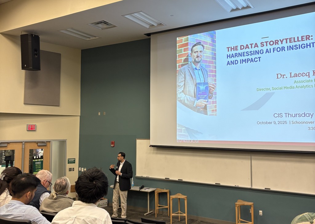
A researcher’s case for taking AI seriously in the media classroom.
There’s a moment that keeps replaying in my head. A student in one of my classes, sharp, curious, clearly going places, held up her phone and said, “I just used AI to write five captions in thirty seconds. Isn’t that kind of terrifying?”
She wasn’t wrong. But she also wasn’t entirely right. And I realized, sitting in that classroom, that what she needed wasn’t reassurance or a warning. She needed a framework. A way to hold the question.
That’s what I didn’t have a course for. Until now.

I’ve spent years researching what happens at the intersection of AI, data, and human understanding, specifically how AI shapes the journey from raw information to public meaning. At the Smart Lab, we look at the full arc: how AI-driven systems surface insights that would otherwise stay buried in data, how those insights get transformed into stories and visualizations, and how those stories land differently across media, marketing, business, and policy. It’s applied work with real stakes. The findings inform how organizations communicate, how campaigns get built, how information reaches the people who need it.
What that research keeps showing me, quietly, persistently, is a gap. A widening distance between what these systems are actually doing and what the people using them, working alongside them, being shaped by them, understand about them. Not a gap in enthusiasm. Everyone is enthusiastic. A gap in literacy. In the capacity to ask the right questions about what AI is doing, who it’s doing it for, and what gets lost along the way.
And nowhere is that gap more visible or more consequential than in media and communications.
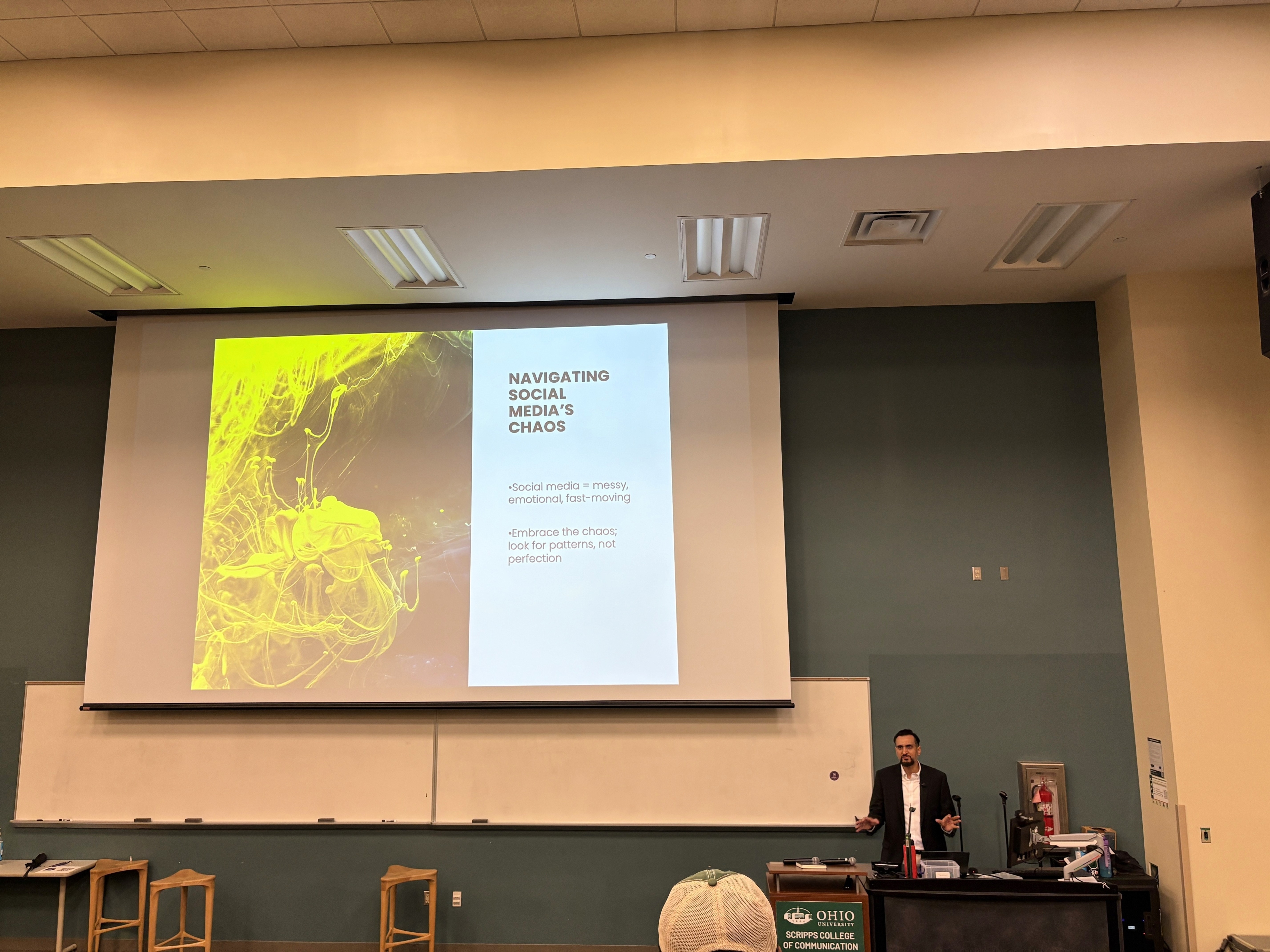
Social media professionals are already working inside AI-restructured environments every single day. The feed your audience scrolls is algorithmically curated. The analytics dashboard you use to measure performance is AI-interpreted. The content recommendation that decided whether your post reached ten people or ten thousand, that was an AI making a judgment call. The tools for generating copy, images, campaign briefs, audience segments, all of it is here, and it’s not going anywhere.
But here’s what I kept seeing in my research, and then seeing again in my classrooms: students who could use these tools fluently but couldn’t explain what the tools were doing. Students who could generate a campaign strategy with AI assistance but couldn’t interrogate whether the audience data underneath it was reliable. Students who were moving fast and building confidently on foundations they’d never examined.
That’s not their fault. No one had given them the map.
So I built one.
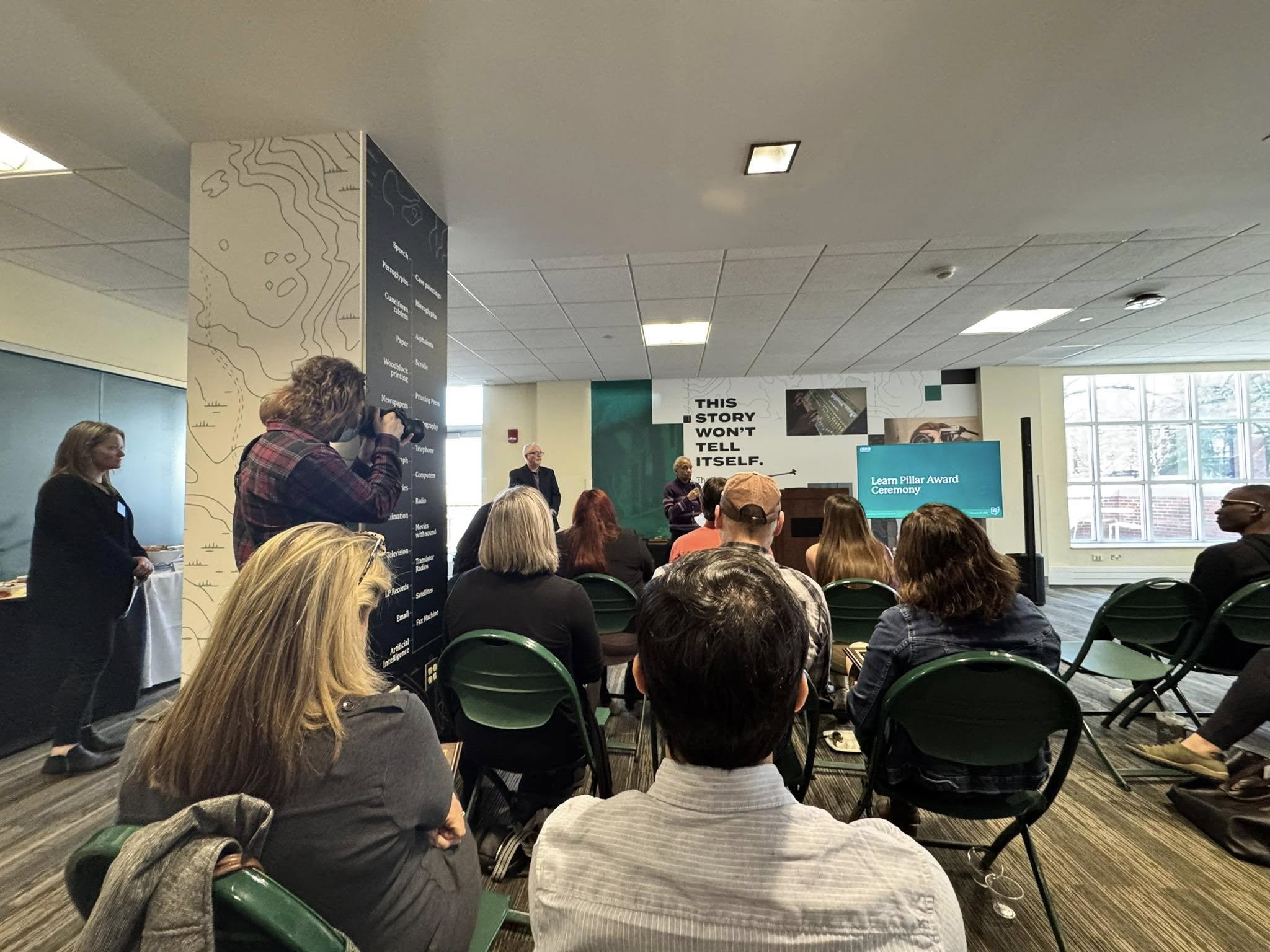
This fall, MDIA4900 — AI for Media Innovation & Strategy, launches as part of our Social Media Certificate program. It’s the course I kept wishing existed. One that takes AI in media seriously as both a professional skill set and an intellectual challenge, grounded not in speculation but in the questions my research at the Smart Lab keeps returning to.
Over 14 weeks, students move from foundations to futures. They learn how AI powers content creation, audience targeting, algorithmic distribution, and brand storytelling. Students actually use these tools to build campaigns, analyze audiences, and prototype media strategies. From generative content workflows and multi-agent systems to platform power and scenario planning for 2030, the course covers how AI works in real media contexts and how to use it with both skill and responsibility. Expect hands-on labs, real campaign projects, and hard conversations about ethics, equity, and what comes next.
Every week, students practice what I call an AI Literacy Check, a structured analysis of a real AI claim, a vendor announcement, a platform policy, a news story, applying the same four questions every time: What is being claimed? What’s the evidence? Who benefits? What’s missing? It sounds simple. It turns out to be one of the hardest and most valuable things I can teach them. Because when a platform says its algorithm is “fair,” or a vendor says its sentiment tool is “94% accurate,” I want my students to be the ones in the room who know what to ask.
What I didn’t expect, in designing this course, was how much the research and the teaching would feed each other.

When you spend time in the lab studying how AI shapes data storytelling across industries, you develop a particular kind of attention, a habit of looking at the seams, the places where a system’s assumptions become visible. When you bring that attention into a classroom and teach students to look at the same seams, something shifts. They stop being consumers of AI outputs and start being readers of AI-driven systems. That shift from fluency to literacy, from use to understanding, is exactly what the industry needs right now.
My student with the five captions and the uneasy feeling was onto something real. The unease was right. What she needed was a place to take it seriously.
This fall, that place exists.
MDIA4900: AI for Media Innovation & Strategy launches Fall 2026 as part of the Social Media Certificate program. Follow along at @drlaeeqkhan.


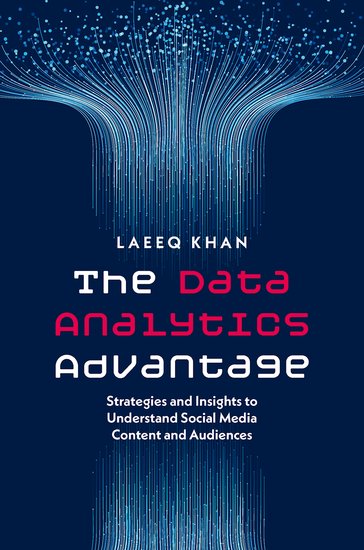


 Amazon: